
I bought a smart lock. Inside the box was the operation manual, printed in two languages — English on one cover, Arabic on the other. The English cover is fine. The Arabic cover is broken.
Not mistranslated. Not badly worded. Broken at the letterform level — every letter standing on its own, unjoined, like a row of separate characters that happen to be sitting next to each other. To anyone who reads Arabic it is immediately, almost physically wrong. It is the visual equivalent of s p a c i n g o u t e v e r y l e t t e r in an English sentence and then printing a hundred thousand copies.
There are actually two failures stacked here. The letters are unjoined — each one sitting in its isolated form instead of connecting to its neighbours. And the sequence runs the wrong way: the characters have been laid out left-to-right, so the words read backwards. Either one alone would be obvious to an Arabic reader. Together they mean the cover is not really Arabic at all — it is a row of Arabic-shaped parts in the wrong order.
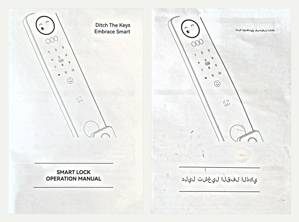
And it shipped. Somebody designed it, somebody approved it, somebody signed off a print run, and it went into a box and out to a customer in an Arabic-speaking market.
Why it happens
Arabic is a cursive script. Letters connect to one another, and most of them change shape depending on where they sit in a word — one form at the start, another in the middle, another at the end, another standing alone. A handful only ever join on one side, so they behave differently again.
Crucially, none of that shaping is stored in the text itself. The characters are held in logical order as plain Unicode. Choosing the correct connected form for each letter — and laying the line out right-to-left — is the job of the text engine, at the moment it renders.
So if the text passes through software that does not do that work, you get exactly what is on this cover: every character in its isolated form, in logical rather than visual order, because the engine never asked which neighbours it had or which way the line should run.
It happens in a handful of predictable ways:
- Arabic pasted into design software without the world-ready text engine enabled — in InDesign, that is the difference between the standard composer and the World-Ready Paragraph Composer
- A font with no Arabic glyphs, so the system silently falls back to something that cannot shape
- Text extracted from a PDF and reflowed into a new document, losing its shaping on the way through
- Design tools, CAD applications and older graphics software that were never built for complex scripts at all
There is a trap in the other direction, too. Some people “fix” this by pasting in pre-shaped characters from the Arabic Presentation Forms block. It can look correct in a dumb renderer — but the text is no longer searchable, no longer copyable as real Arabic, and will often break again the moment it meets software that tries to shape it properly. A cover that looks right and a file that is right are not the same thing.
The part that actually matters
Here is the uncomfortable bit, and the reason I am writing this up rather than filing it as a curiosity.
Every quality check in that production chain worked exactly as designed, and every one of them passed it.
The designer placed the text and it looked like Arabic. The project manager reviewed the proof and it looked like Arabic. The print buyer approved it and it looked like Arabic. It has the right shapes, the right dots, the right general texture on the page. If you do not read the script, there is nothing to notice.
That is what makes this failure different from a typo. A typo in English gets caught because everyone in the chain reads English. Broken Arabic gets caught only by someone who reads Arabic — and in most production chains, that person does not exist. The translator saw the text in a spreadsheet or a CAT tool, weeks earlier, before it was ever placed in a layout. Nobody who could actually read it ever looked at the finished artwork.
The cost is real. A reprint on a manual is the cheap version. On packaging, labelling, or anything regulated, it is expensive and occasionally it is a recall. And the customer who opens the box notices instantly — not as a small production error, but as a signal about how much the company cared about their market.
What reading the script actually buys you
Catching this is the obvious one. It is also the smallest, because the rest are judgement calls that no checklist can make:
- Font selection. Whether an Arabic face genuinely pairs with the Latin one beside it, and whether it stays legible at the same point size — Arabic usually does not
- Line breaks and justification. Where a line may break, and when a kashida is the right way to justify rather than stretching the word spacing
- Mixed-direction text. What happens when a Latin brand name, a phone number or a model code sits inside an Arabic sentence — where bidirectional layout most often goes wrong
- Mirroring decisions. When flipping a layout is right and when it is not. A mirrored photograph with a logo in it is worse than an unmirrored one
- Truncation. Spotting that a translation has been silently cut off mid-word, which looks like nothing at all if you cannot read it
- Register. Noticing that the copy is in the wrong tone or the wrong regional variety for the audience
None of that is exotic. It is simply invisible to anyone who cannot read the output.
The honest version
You do not need a native reader for every language in a project. I have typeset in over 130 languages and I read a small fraction of them.
What you need is for somebody in the chain to be able to read the finished artwork — either on the production side, or as a deliberate in-country review step before it goes to print. Most pipelines have neither, and simply assume that because the translation was correct when it left the translator, it is still correct now.
It very often is not. Everything that happens between the translation and the printer is where scripts get broken, and none of it is the translator’s job to check.
For Arabic, Farsi, Urdu, Hebrew and Pashto, I am that person. I read and write Arabic, and I have been setting right-to-left type since 2005. It means the file that leaves me has been looked at by someone who can tell the difference between text that looks like Arabic and text that is Arabic.
Setting a document in a script nobody on your team reads? Send it to me and I will tell you what is wrong with it →
More on this: Challenges of right-to-left typesetting · The Qatar World Cup kashida · Multilingual typesetting services